Product design case study · Mobile search
The homepage is where the trip begins.
+6.38%
hotel searches
+9.31%
train searches
+0.69%
flights held, the guardrail
Role
Led research, presentation & design
Platform
Web mobile · homepage & search
Timeline
6 weeks from brief to shipped
01 · The prototype
Try the flow
Every mode icon at the top is a search entry point, tap Hotels, Trains or Cars and the sheet retargets to that search. Tap the destination field, type on the keyboard and watch the results match what you type.
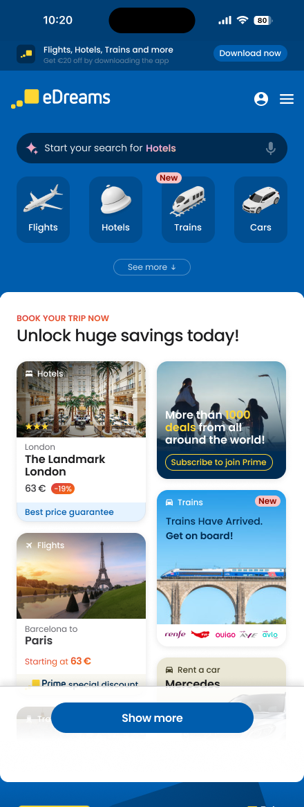
Get €20 off — download the app
Download nowBOOK YOUR TRIP NOW
Unlock huge savings today!
 Hotels
The Landmark London

More than 1000 deals from all over the world!
 Flights
Paris
from 63 €
 TrainsNew
Trains have arrived.
Get on board!
- 1
Every product, one tap away
The four mode tiles give flights, hotels, trains and cars equal weight, the brief's core ask. Tap any of them and the sheet retargets to that search instantly.
- 2
Deals lead, search follows
Live prices do the selling while the sheet rests half-open, discovery without hiding the merchandise. It grew cross-product traffic without costing flight continuance.
- 3
The match is the interface
Type "Lon" and airports re-rank as you type, your own letters highlighted. The list answers before you finish the word, the AI-assisted start the brief asked for.
02 · The brief
Three objectives, aligned before a pixel moved.
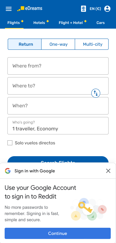
Before, the legacy homepage
The old homepage was a flight search form and little else: tabs, four fields, a button. Great for travellers who already knew they were flying, invisible for everything else the company sells.
Hotels, trains and cars had no way in, campaigns had no surface, and the page's speed budget was spent on widgets rather than the journey. That flight-centric shape is what the three objectives below set out to change.
SEO, 100% aligned
Improve page performance
Page speed and engagement as design requirements, not afterthoughts, with weekly SEO sessions keeping them at the core. A proper .com homepage, distinct from the /flights page, so each serves coherent content instead of competing for the same searches.
- ✓Mobile & desktop consistency
- ✓Streamlined layout, less widget overload
- ✓Easy cross-linking between products
- ✓Design that encourages scrolling without costing speed
Product
Give every product visibility
Move away from a flight-centric strategy, the homepage as a growth surface for hotels, trains and cars, not a directory.
- ✓Equal visibility across all offerings
- ✓Retail techniques for trust & security
- ✓Clear search entry points everywhere
AI + Tech
Make starting a search easier
AI touchpoints that personalize the journey, on a frontend built for speed and stability.
- ✓Speed and Core Web Vitals as requirements
- ✓Semantic headers and titles
- ✓Static site generation
- ✓Micro-frontends so teams ship independently
The hard constraint: give hotels more visibility and grow hotel searches while protecting flight searches, at most one conversion-rate point of damage.
How the prototype answers: four mode tiles give every product equal weight; live deals lead the page and do the retail selling; every tile, card and field is a search entry point; and the whole experience is motion-optional and performance-first.
03 · Explorations
The directions we weighed before shipping one.
The shipped design is one point in a space of options. Switch an axis and the prototype replays with that direction.
The intro
Pace
The shipped choice, each phase breathes, so the brand earns its eight seconds.
Style
Shipped. The mark gathers energy, then bursts into the four products it stands for.
Showing the products
Layout
Shipped. Four equal cards, every product gets the same stage, the brief's core ask.
Get €20 off — download the app
Download nowBOOK YOUR TRIP NOW
Unlock huge savings today!
HotelsThe Landmark London
More than 1000 deals from all over the world!
FlightsParis
from 63 €
TrainsNewTrains have arrived.
Get on board!
Motion is optional
Every moment has a quiet twin.
Motion on. The intro plays in full, the sheet springs between snap points, letters light up as you type.
Reduced motion on. The same flows, same content, same snap points, delivered as instant fades. Nothing is locked behind animation; the OS preference is detected, not asked.
04 · Results
Cross-product traffic grew. Flights didn't pay for it.
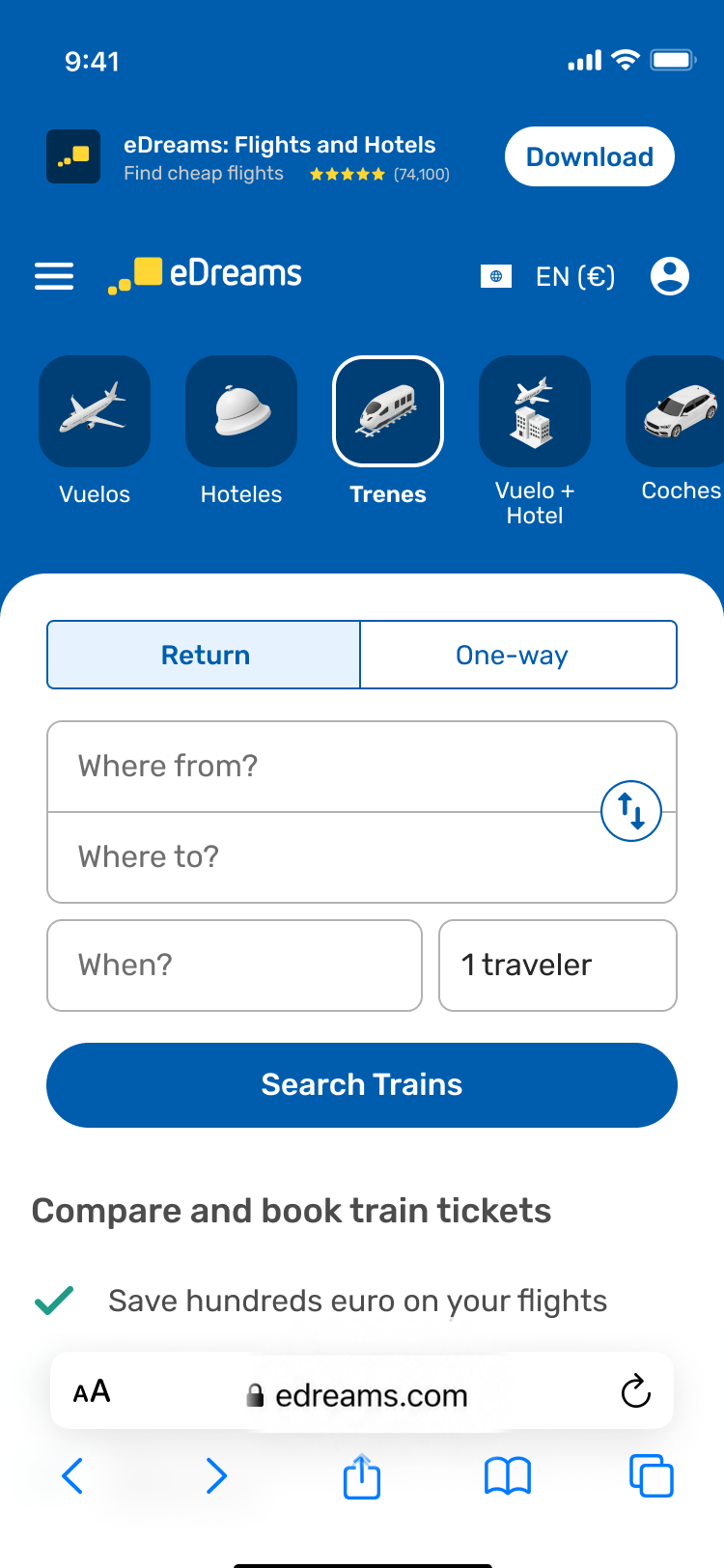
The compromise
The search bar came back. On purpose.
The numbers below belong to this final iteration, the one where the explicit search form returned to the page. The iterations before it hid search behind lightweight entry points: elegant to browse, but in testing they were quietly costing flight continuance. Every point of flight intent we lost was revenue off the core product, and it showed up in the totals.
So the search bar came back, but different. Not the tall four-field form of the legacy page: a compact strip that spends a fraction of the vertical space, so the deals and widgets below the fold stay in view and the gains from the product icons are kept. Flights get a real, visible form, dates, route, travelers, one glance away. Cross-product growth only shipped once flights stopped paying for it. The winning design wasn't the boldest one; it was the one that protected the core while growing the rest.
How we got there
The A/B results for that final design: significant growth in cross-product traffic while flights performance held, the exact trade-off the brief called for.
+6.38%
Hotels continuance
+9.31%
Trains continuance
+0.69%
Flights held, inside the guardrail
Relative lift, test vs. control. Continuance = share of homepage visitors who move on to search results. A/B test ran for 2 weeks across 1,589,898 users.
- Continuance
- Share of homepage visitors who continue to search results, the top-of-funnel health metric for each product.
- Confirmation / home
- Visitors who reach a booking confirmation or return to the homepage, the downstream signal that traffic quality held.
- Prime 1st booking
- First-time subscriptions to the Prime membership. Flagged inconclusive rather than rounded into a win.
- Relative lift
- Percentage change of the test variant against the control group, not against the previous period.
The constraint held: flights continuance moved +0.69%, well inside the one-point guardrail, while hotels and trains continuance grew double digits in relative terms. Prime first bookings moved -1.12%, inconclusive, and flagged honestly as the open thread.
What I’d test next
01
Search density
Test how much of the compact flight form can collapse without weakening intent or confidence.
02
Adaptive priority
Test whether product order should respond to membership, trip history, or current demand.
03
Return behavior
Measure whether remembered destinations make repeat searches meaningfully faster without feeling presumptive.