Finding 01
Information overload
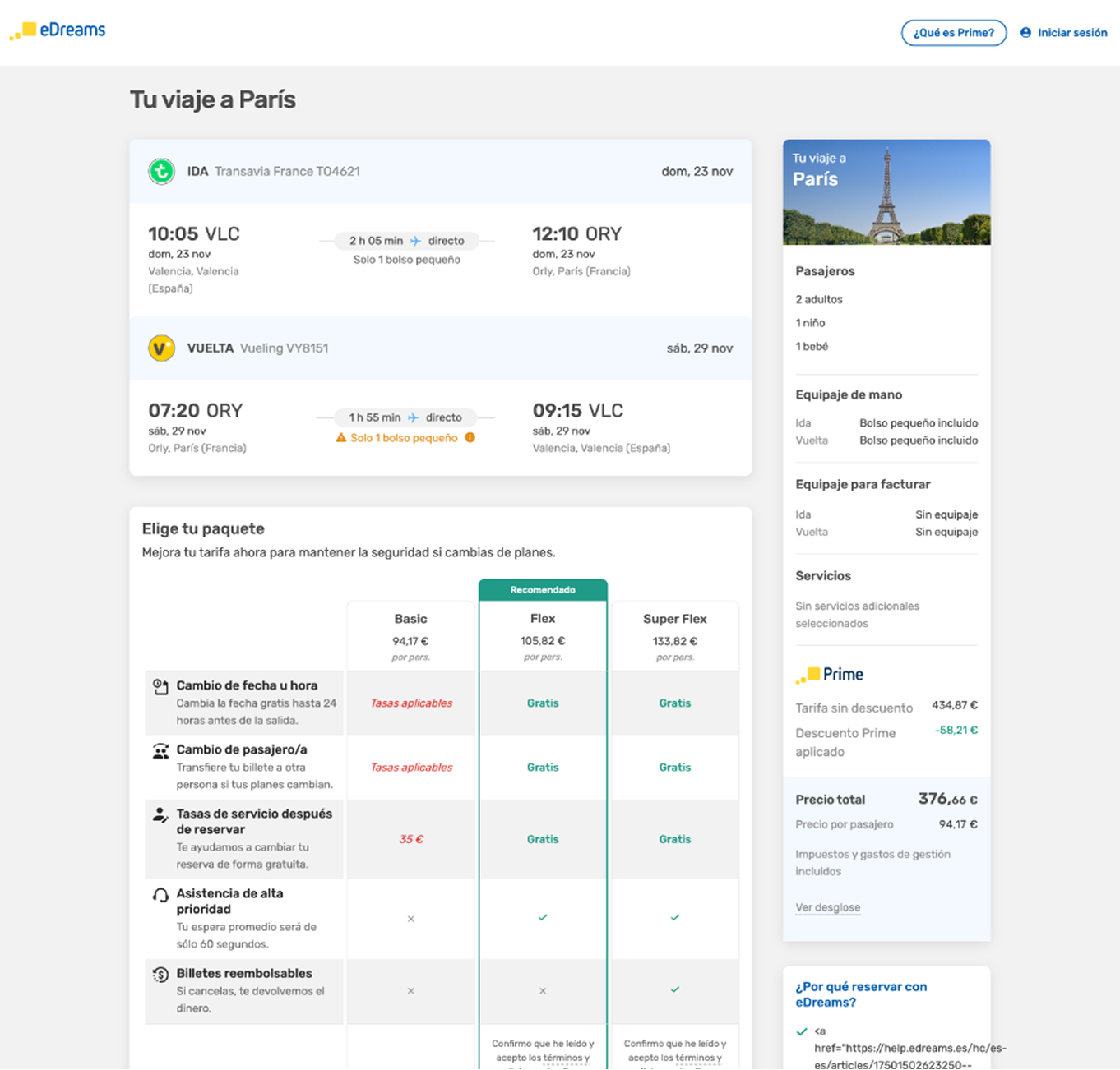
Itinerary, product details and pricing compete for attention. Travelers scroll repeatedly to reconcile the total.
High cognitive load
I reframed a high-friction utility panel as a persistent review and retail hub, keeping itinerary, extras and price legible through the entire checkout.
Scope
Flights · Trains · Hotels
Evidence
37 usability sessions
Focus
Trust + retail value
01 · The problem
The sidebar repeated information, obscured price logic and disappeared exactly when reassurance mattered most.
Finding 01
Information overload
Itinerary, product details and pricing compete for attention. Travelers scroll repeatedly to reconcile the total.
High cognitive load
Finding 02
The total disappears
Long desktop pages push the cart and total out of view, breaking the validation behavior users depend on.
Forced back-navigation
Finding 03
Retail value is buried
Prime savings read as subtle line items, while extras cannot be added or changed from the sidebar.
Lost upsell revenue
cited inability to see total cost upfront as the top checkout abandonment reason.
02 · The final proposal
The redesigned sidebar turns a passive receipt into a structured review surface for itinerary, baggage, services, savings and total price.
We'll sort out your check-in and get your boarding pass for you.
Cancel your trip and get money back every time.
Choose supportSelect Basic, Standard or Premium.
Add servicesSelections appear in the persistent summary.
Apply PrimePrice and savings confirm immediately.
Persistent context
Trip, extras and price remain visible as the main stage changes.
Progressive retail
The offer appears at the relevant decision point, not as a detached promotion.
Closed feedback loop
The sidebar confirms the outcome without forcing travelers to recheck the page.
Design decision
Rapid AI prototyping with Figma Make created a shared visual language for Product, Business and Engineering. The team chose a low-risk first move: preserve the familiar persistent summary, then rebuild its information architecture.
“Every selection on the main stage was validated by checking the sidebar.”Usability testing synthesis
04 · Business case
conversion · trust · upsell · scale
conservative range to conversion target, driven by lower price anxiety.
Prime savings remain visible until the final moment before payment.
shared architecture across Flights, Trains and Hotels.
less back-navigation, greater trust and fewer support questions.
05 · Roadmap
The system scales without structural rework, while research findings define the next releases.
Add total-price tooltip
Clarify that price covers all legs.Refine bag detail
Expose dimensions and allowances.Activate retail actions
Add and change extras in place.Test price presentation
Compare different approaches to showing prices upfront.Measurement begins at release. The A/B read on the first shipped increment replaces the targets above with observed data.
Design principle
The sidebar is a contract, not a widget.